
Data Stories: Sunshine, Snowfall, and Seasonal Shifts
It’s finally spring in the Northern Hemisphere, so let’s look at methods for visualizing sun and snow over time.
- By Upside Staff
- May 16, 2018
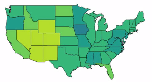
This animated map shows sunlight in the U.S. over the course of a year. What other kinds of data might be a good fit for this kind of quick animation?
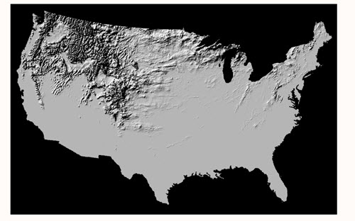
You can watch where snow fell through the first half of last winter on this animated relief map, and the geographer who created the map explains on his site how he collected the data and created the animation.
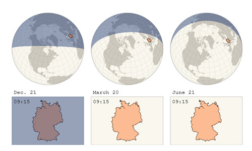
This article about daylight saving time in Germany includes an animation that demonstrates how the amount of daily sunlight shifts over a year and an interactive chart that shows how the timing of sunrise and sunset would change if they didn’t turn the clocks back.