
Data Stories: Mapping the Spread of Spring
Data visualizations can show the changing seasons by mapping changes in temperature, weather, plants, and animals.
- By Upside Staff
- April 11, 2018
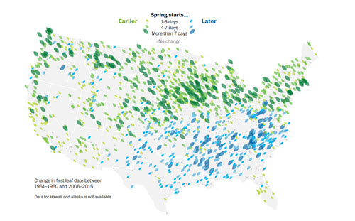
The Washington Post includes data from several perspectives in this analysis of changing seasons, including first-leaf dates, temperature projections, and the history of cherry blossom timing.
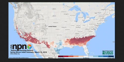
The National Phenology Network collects long-term data about plants and animals in the U.S. It’s one of the sources used in the article above, but you can dig further into the spring index data and find updated maps and animations at the NPN’s Status of Spring website.
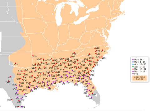
This collaborative project produces an annual migration map for the ruby-throated hummingbird. It’s a good example of how you can look at a much larger trend, such as annual seasonal temperature, by tracking a smaller piece of data that is affected by that trend.