
Data Stories: Rising Rents, Population, Urban Diversity
These visualizations help you choose when to rent, see where the most people live, and understand diversity in American cities.
- By Upside Staff
- March 21, 2018
Manage Housing Costs
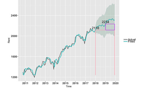
In this medium post, data scientist Zhen Liu shares how she created visualizations that demonstrate when you should sign a two-year lease versus a one-year lease.
Population Bubbles
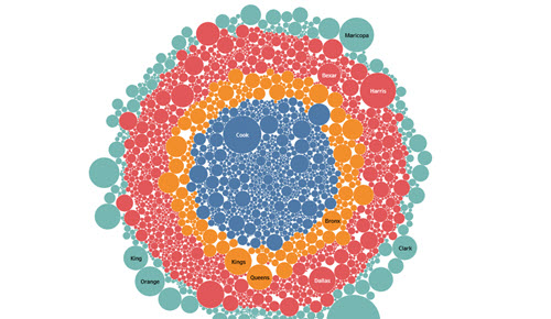
This simple interactive chart shows the relative population for every county in the U.S. Hover over the image or search to highlight smaller counties.
Levels of Diversity
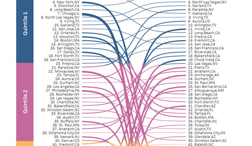
A city can have a diverse population overall and still have fairly segregated neighborhoods. This Tableau chart demonstrates the relationship between these variables for 100 U.S. cities.