
Data Stories: Ordering, Pronouncing, and Eating Delicious Food
These visualizations compare restaurant attendance, pronunciation, and fast food calories.
- By Lindsay Stares
- March 7, 2018
Restaurant Popularity Maps
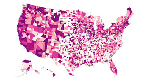
Google News Lab and design studio Polygraph worked together to create this series of maps that show where different types of restaurants are more popular. Make sure to experiment with the interactive map, where you can answer questions such as: Where are burger joints more popular than sandwich shops?
What Goes With Tea?
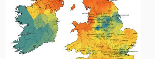
If there’s anything contested more than the relative merit of regional cuisine, it might be regional pronunciation. Dictionaries will tell you there are two ways to pronounce the word “scone,” but this map shows that, at least in the UK and Ireland, it really depends on where you ask.
Tracking Fast Food Calories
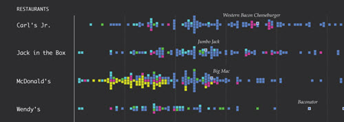
This chart from Flowing Data shows the range of calories in menu items from popular fast food restaurants. Although the chart would be more useful if it were more detailed or interactive, a few notable items are called out, and it’s interesting to see where the averages lie.
About the Author
Lindsay Stares is a production editor at TDWI. You can contact her here.