
Data Stories: Avoiding Visualization Failures
Data visualizations are powerful, but they can be misinterpreted or misleading -- accidentally or intentionally.
- By Lindsay Stares
- February 28, 2018
Misreading a Confusing Chart
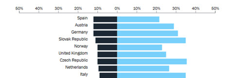
This article explains why a confusing chart design for an OECD study on job automation caused media coverage to misinterpret and misrepresent the results of the study. The author also provides a suggested alternative chart.
Common Mistakes
Confusing or poorly designed data visualizations often stem from a few common errors. Here are a handful of examples of what not to do.
Alternatives to Bad Visualization
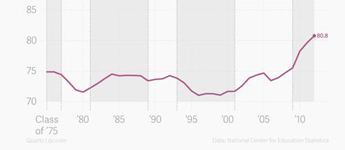
This Quartz piece is an older article, but it does a good job collecting examples of misleading graphs and demonstrating how each set of data could be more accurately and clearly represented.
About the Author
Lindsay Stares is a production editor at TDWI. You can contact her here.