
Data Stories: Clarity, Uncertainty, and Accuracy in Visualizations
How intent affects visualization choices, how to display uncertainty, and an example of misleading data.
- By Lindsay Stares
- January 31, 2018
Choose Your Chart Carefully
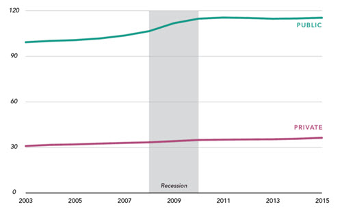
Depending on the purpose of the visualization, you might choose to display the same data many different ways. This article explains seven possible ways to show a set of college admission data and discusses the pros and cons of each.
Displaying Uncertainty
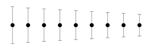
Many data visualizations include projections, assumptions, errors, or other uncertain data points. This article can help you find the best way to communicate the uncertainty to your audience.
Make Sure You Understand Your Data
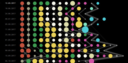
Data visualization designer Christian Laesser thought he had found an interesting pattern -- receipts from a supermarket implied that a series of customers had all scanned items in the same order -- and demonstrated it in an interactive visualization. However, as he explained on Twitter, all he had discovered was the store’s internal categorization system.
About the Author
Lindsay Stares is a production editor at TDWI. You can contact her here.