
Data Stories: Understanding Histograms, Joyplots, and Sorting Algorithms
A complete toolbox for data visualization contains many methods for sorting and displaying data.
- By Lindsay Stares
- December 13, 2017
Creating a Histogram
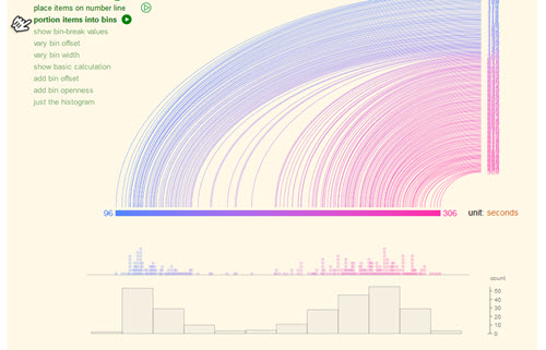
Histograms are a common way to aggregate data and show value distribution. This interactive site explains in detail how to construct them.
Showing Distribution Over Time
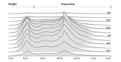
One way to expand on the information in a histogram is the visualization known variously as a stacked distribution, frequency trail, or joyplot.
Ways to Sort Data
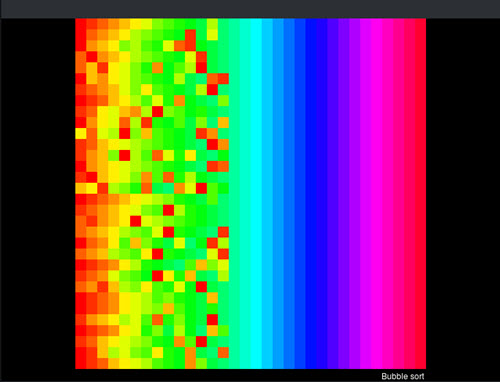
This series of animated images illustrates how various sorting algorithms work. There are Wikipedia links interspersed in case you aren’t familiar with the terms.
About the Author
Lindsay Stares is a production editor at TDWI. You can contact her here.