
Data Stories: Best Practices for Charts, Data Journalism, and Visualizations
The unbreakable rules for charts, the growing influence of data journalism, and a short video on how data visualizations connect to our lives.
- By Lindsay Stares
- February 22, 2017
Basic Rules for Charts and Graphs
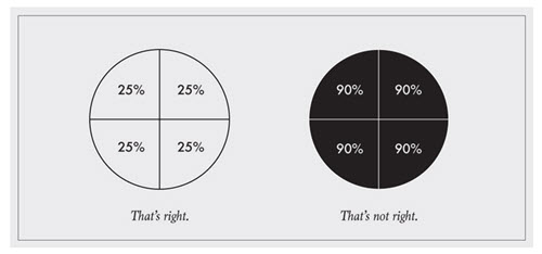
There may be many ways to use charts and other visualizations, but there are some foundations you should know. This post from Flowing Data describes the basic rules that should never be broken.
Data Storytelling and Data Journalism
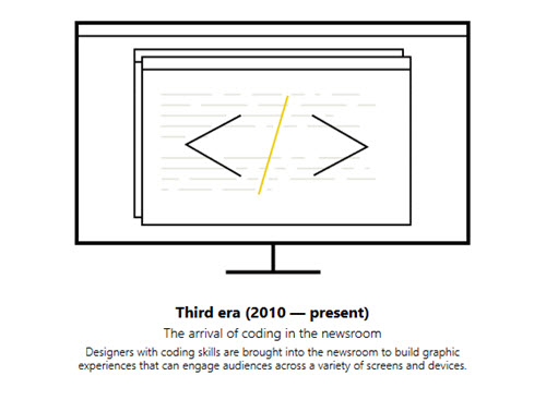
Microsoft Story Labs provides this long article about the history and current state of data journalism. It includes insight and examples that apply to business-focused data storytelling as well.
The Experience of Creating and Viewing Data Visualizations

This enjoyable short from PBS connects data visualization to the history of science and touches on the many ways we use visual media to convey information. The speakers also describe the importance of finding truth and new discoveries in data and draw connections between data and culture.
About the Author
Lindsay Stares is a production editor at TDWI. You can contact her here.