
Data Stories: Inspire Engagement with Interactivity
Three examples of interactive visualizations: drawing a chart before revealing the data, a quiz to test your demographics knowledge, and a game to teach correlation coefficients.
- By Lindsay Stares
- January 18, 2017
Drawing Conclusions
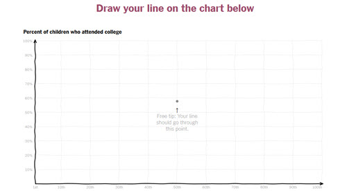
Are you finding it challenging to ask your audience to really engage with the data behind a question? The New York Times staff demonstrates one solution in this short piece on family income and college attendance. It forces you to draw what you think the chart looks like, and then reveals how the data does and doesn’t conform to your expectations.
Engage Your Audience with Competition
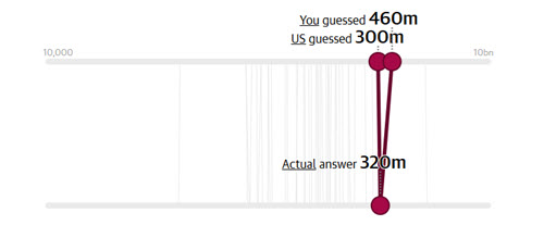
This quiz from The Guardian invites you to find out how your perception of everything from population to home ownership to happiness compares to both the results of a survey and actual data. Very few people can resist the opportunity to prove that they are better than the average survey taker or Internet user. How could a little competition improve your data collection?
Correlation as a Game
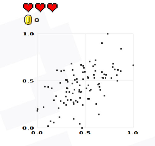
This little Web game asks you to guess the correlation coefficient in a scatter plot. It’s not too challenging, but the animation and retro sound effects might keep you playing. The Ph.D. student behind the game is using the results to look for patterns in how people perceive scatter plots. Could you use some simple game to collect data or train users on a process?
About the Author
Lindsay Stares is a production editor at TDWI. You can contact her here.