
Data Stories: Tracking Trains, Efficient Escalators, Drilling Down
These visualizations show the volume of people on London’s public transit, demonstrate a test to improve crowded escalators, and explore deep beneath the surface of the earth.
- By Lindsay Stares
- November 30, 2016
The Rhythm of a City
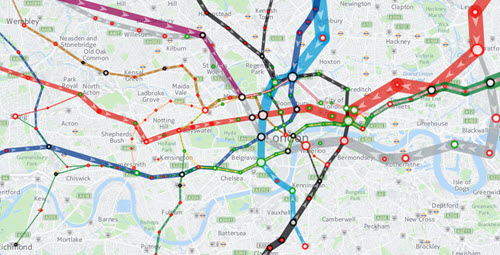
This animation shows the volume of trains and passengers on the London Underground over a single day. You can watch the swell of rush hour or click on individual lines and stations for detailed information. It’s a demonstration piece for Here, a company that provides data-driven location solutions.
How Could Escalators Be More Efficient?

An experiment by the London Underground looked at whether encouraging commuters to stand on both sides of the escalator (as opposed to standing on the right and walking on the left) would ease congestion. The animation in this article is a good example of using a visual to explain unintuitive test results.
Imagine Traveling Deep Underground

The BBC created this fun animated graphic that allows you to scroll down to explore beneath the earth. Note the changing sine wave in the center that helps you visualize how the scale of the graphic changes as you move down.
About the Author
Lindsay Stares is a production editor at TDWI. You can contact her here.