
Data Stories: Using Pie Charts, Grid Maps, and Text Analysis
Learn about the readability of pie and donut charts, explore how to make an easy grid map, and see how to best use graph analysis on text.
- By Lindsay Stares
- November 9, 2016
How Bad Are Pie Charts, Really?
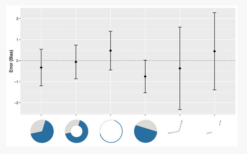
A lot of conventional wisdom about visualizations cautions against using pie charts; the argument is that they are difficult to read properly. Robert Kosara (senior research scientist at Tableau Software) and Drew Skau set out to determine how different pie and donut chart designs affect viewers.
Their findings imply that most viewers are not using the angle to judge the amount. Kosara walked through the findings with explanatory charts on his eagereyes blog.
How To: Create Grid Maps
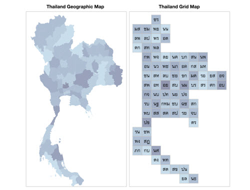
A grid map is a type of visualization that can show smaller regions equitably alongside larger regions. It’s not suitable for every purpose, but it takes up very little space to store or upload. Data visualization scientist Krist Wongsuphasawat shared some simple instructions for making your own.
Text Analysis and Literature
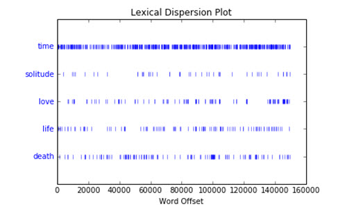
In this Medium post, Francesco Cauteruccio demonstrates a variety of text and graph analysis techniques on the novel One Hundred Years of Solitude, including finding words that frequently occur together and using a graph to judge centrality.
About the Author
Lindsay Stares is a production editor at TDWI. You can contact her here.