
Data Stories: See the Biggest Big Pictures
Visualizations can help us understand numbers or trends that are incredibly large. Visit today’s links and explore the biggest pictures of money, population, and time.
- By Lindsay Stares
- September 7, 2016
All the Money in the World
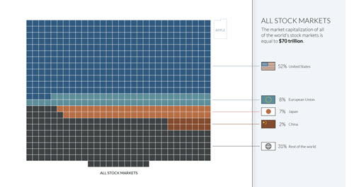
This infographic from the Money Project demonstrates the relative wealth of individuals, companies, and markets. It includes many definitions of money -- from physical coins and bills to international stock markets.
All the People in the World

Worldometers uses reputable data sources to visualize population growth. On this mile-high graphic, see an icon for every single person on earth and click “watch as we increase” to see (estimated) new people added in real time.
All the Time That’s Ever Been

Step through this interactive webtoy by clicking on the image and watch the flow of time expand. You can also navigate forward and backward via “Okay +” and “- back.”
About the Author
Lindsay Stares is a production editor at TDWI. You can contact her here.