
Data Stories: Brunch, Health, and Hamilton
Let’s look at some more entertaining uses of data visualization. Discover what time brunch is, watch the rise of global health, and read how an algorithm can chart rhymes.
- By Lindsay Stares
- August 17, 2016
What Time Is Brunch?
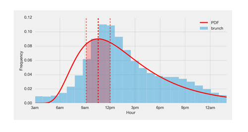
This may seem like a facetious question, but software engineer Ben Jacobson decided to analyze over 100 million tweets to reach a consensus. His explanation of his thought process and approach is a fun example of how you might run analytics on a large data set in search of an answer.
Follow Increasing Global Health
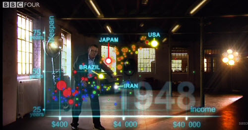
Professor Hans Rosling has made a career out of presenting statistics in visually and emotionally engaging ways. Rosling’s optimism is infectious, and many videos of his work are available online. This short excerpt from the BBC’s “The Joy of Stats” demonstrates the growing global health and wealth from 1810 to 2010.
A New Algorithm Illustrates Hamilton and the Art of Rhyme
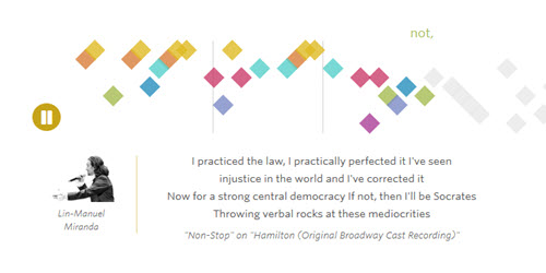
A team at the Wall Street Journal made up of designers, developers, and data journalists created a fun animated presentation about the Broadway smash Hamilton. The team wrote a program that could analyze and visualize rhyming syllables. Take a look at their process -- from idea to program to final polished product -- in a blog post on Source and read details of the methodology on wsj.com.
View the final presentation to see the algorithm animate different rhyme schemes. Make sure you also experiment by feeding your own poetry or lyrics into the algorithm at the bottom of the page!
About the Author
Lindsay Stares is a production editor at TDWI. You can contact her here.