
Data Stories: Three Ways to Look at the Data behind Music
Music is math already according to some ways of thinking. It’s only natural that many data visualizations have been created to explore the history or popularity of different genres and artists.
- By Lindsay Stares
- June 22, 2016
Calculate the Popularity of a Song
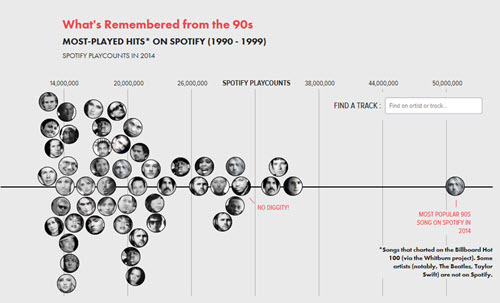
How would you try to determine the longevity of a popular song? These interactive and entertaining charts use the popularity of older music on Spotify to explore the differences between songs that were popular the year they were released and songs that have maintained or gained fans to this day.
Explore a Timeline of Musical Genres
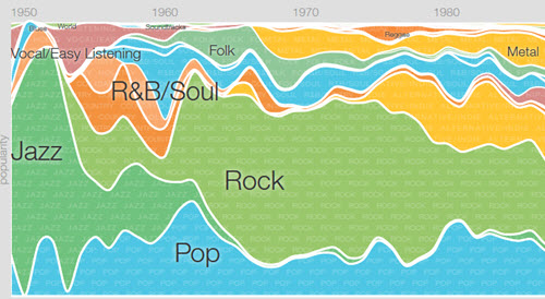
Google’s Music Timeline uses data from Google Play Music to chart the popularity of entire genres. It isn’t tracking what was popular each year but rather how popular the albums released that year are today. You can drill down into subgenres or search for a specific artist or album to view. Make sure to read the FAQ for more on how the chart was created.
Trace the History of Rock
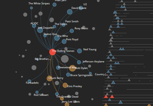
Here’s one more way to look at the data behind music. Silicon Valley Data Science took a list of 100 songs representing the history of rock music (as compiled by The Guardian) to create this interactive infographic. It charts the influences between musicians and notes how the chosen song(s) compare across certain qualities to the list overall. The creators also provide links to all the data and tools they used.
About the Author
Lindsay Stares is a production editor at TDWI. You can contact her here.