
Data Stories: Mapping Immigration, Elections, and Floating Garbage
Use these maps to investigate how immigration changed over time, how ocean currents collect floating material, and consider how you might visualize a potentially misleading data set.
- By Lindsay Stares
- June 8, 2016
Immigration as a Global Rainbow
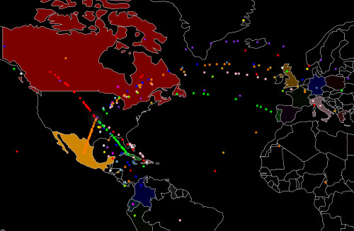
This impressive animation shows all immigration to the United States from 1820 to 2013. The color coding and the movement mean that you can easily see how immigration rates from different regions rose and fell over time.
Animated Ocean Currents
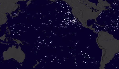
Here’s another animation, this one from NASA, demonstrating a project to track global ocean currents and visualize the creation of the ocean “garbage patch.” Watch the first video for an overview of the project, and if you want more detail you can watch each individual animated model.
Misleading Maps in Election Coverage
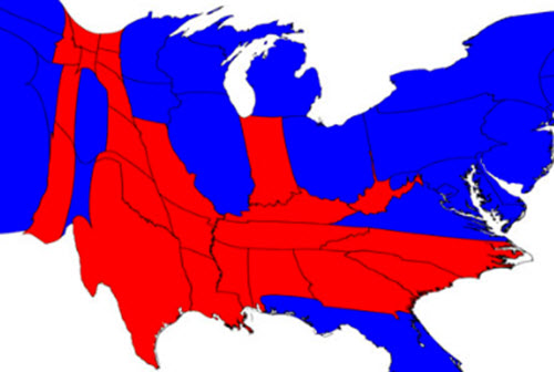
The data in these example maps is from 2012, but the question is important for this year: how can we accurately represent the complicated U.S. election system? This article presents several options, none perfect, for how to display the relationship between state lines, party, population, and the electoral college. Making a great data visualization is sometimes about avoiding misunderstandings.
About the Author
Lindsay Stares is a production editor at TDWI. You can contact her here.