
Data Stories: Charting the Unemployed, Stock Value and Mergers, and the Famous
Examining unemployment, post-merger stock values, and Facebook comments to Mark Zuckerberg.
- By Lindsay Stares
- May 11, 2016
View Unemployment at Macro or Micro Levels
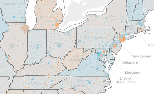
Visit Overflow Data to explore U.S. unemployment statistics in an interactive Tableau chart. You can filter the data by year or range of years with sliders. Choose to see a specific region, state, or even a single county from drop-down menus or by hovering over the map. This is a good example of how a simple data visualization can help identify trends and inspire viewers to delve deeper into data.
Do Mergers Increase Business Value?
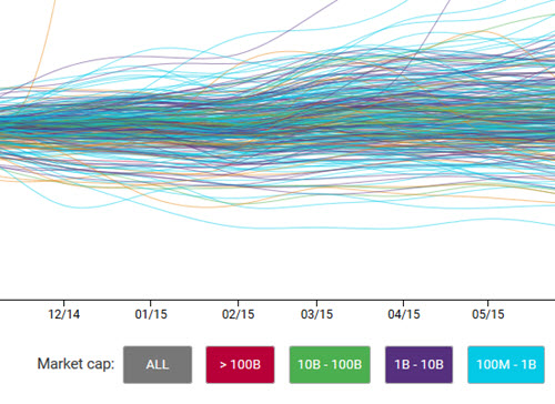
Digital magazine Braid brings out the truth about stock value and mergers with this interactive chart. Color and line artfully show the price fluctuations of different-sized companies, and the chart allows you to easily view only companies that spent funds on mergers and acquisitions.
Practicing Data Analysis on Social Media

This personal account follows a software engineer’s attempt to analyze thousands of Facebook comments received by Mark Zuckerberg. After much trial and error, the author doesn’t learn much about Facebook comments or Zuckerberg, but the piece demonstrates the kind of inquisitive and experimental thinking that can lead to great data insights.
About the Author
Lindsay Stares is a production editor at TDWI. You can contact her here.