By using tdwi.org website you agree to our use of cookies as described in our cookie policy. Learn More

TDWI Upside - Where Data Means Business

Data Stories: Yellow and Green Boxes

These data visualizations go deeper into the popular game Wordle.


Optimizing the First Guess

sample of data visualization, linked to full visualization at Reddit 

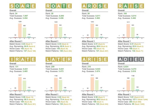
It seems like everyone is either playing Wordle or talking about how they aren’t playing Wordle. (Even the New York Times.) This Reddit poster tries to quantify the value of first words to guess.


Finding a Solution

sample of data visualization, linked to full visualization at Raw Data Studies 

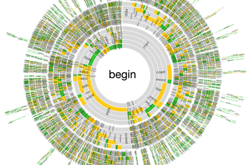
This programmer explored how optimal Wordle solutions can be found with decision trees.


Defining Five-Letter Words

sample of data visualization, linked to full visualization at StaDaFa.com 

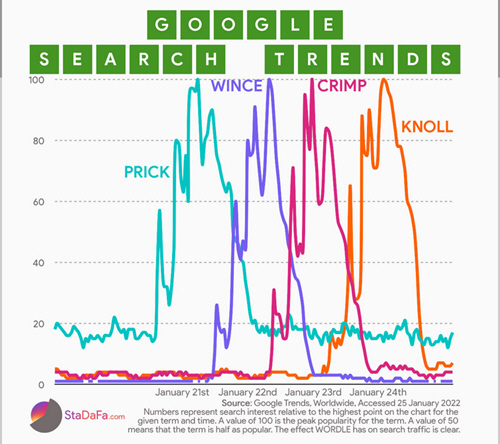
Solutions might not be common words, and this chart shows how Wordle solutions cause spikes in Google traffic.


TDWI Membership

Accelerate Your Projects,
and Your Career

TDWI Members have access to exclusive research reports, publications, communities and training.

Individual, Student, and Team memberships available.