Data Stories: The Current State of COVID-19
The speed of the Omicron variant tearing around the world has data visualization makers struggling to keep up.
- By Upside Staff
- January 12, 2022

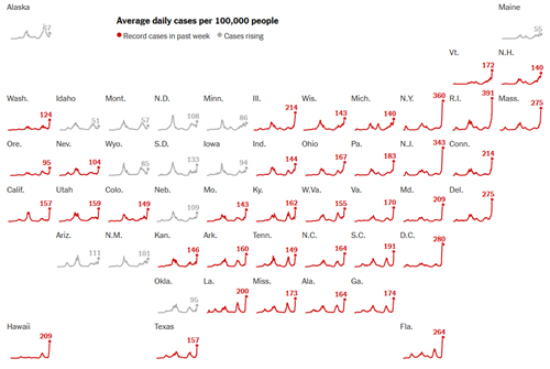
This recent piece from the New York Times walks you through how to understand charts and data for the Omicron variant.

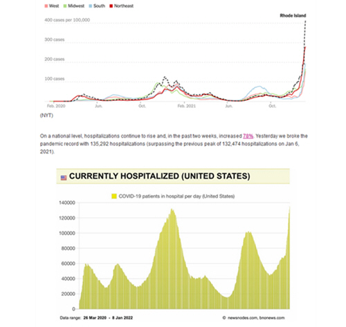
This free newsletter from epidemiologist Katelyn Jetelina collects charts, research, and news from around the world and helps contextualize the findings.

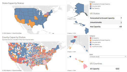
This interactive set of maps (currently in progress and still being improved) allows you to explore current hospital capacity across the U.S.