Data Stories: Cost of Living, Speed of Salary, Price of Light
Minimum wages by state, comparing large salary ranges, and the history of artificial light.
- By Upside Staff
- April 7, 2021

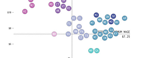
This animated graph from Flowing Data shows the relationship between the minimum wage and average cost of living over time across the U.S.

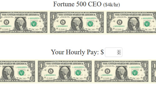
This series of simple animations contrasts the average pay for various professions and also shows how fast a few large companies and government agencies make or spend money respectively.

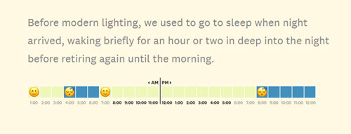
This humorous scrolling visualization from The Pudding demonstrates how long it takes for the average person to earn enough money to pay for artificial light versus how long it took at two points in history.