Data Stories: Tracking the Ongoing Pandemic
Recent data visualizations show Australia’s efforts to contain COVID-19, how rapidly information about the pandemic changed over the last year, and how quickly vaccination is happening.
- By Upside Staff
- February 10, 2021

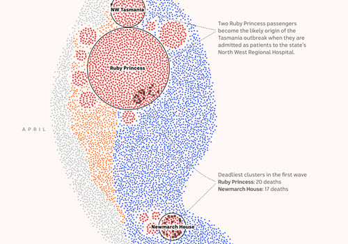
Multiple detailed graphics in this article from Australia’s ABC News show the different waves that country faced over 2020 and multiple perspectives on how the virus spread.

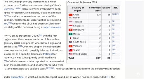
This animation is a time-lapse of the Wikipedia article on COVID-19. It shows how fast knowledge about COVID-19 grew and changed.

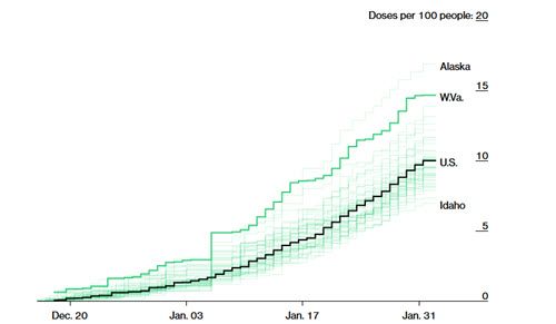
Bloomberg is tracking the administration of COVID-19 vaccines both in the U.S. and globally.