
Data Stories: Visualizations about Population, Commutes, and Home Prices
Comparing population around the world, commutes around the U.S., and changing real estate prices.
- By Upside Staff
- November 25, 2020

Visual Capitalist uses a series of 3-D map images to show how population density patterns are different around the world.
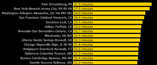
Overflow Solutions provides this simple chart that highlights the U.S. metro areas with the worst average commutes (before COVID-19 and the increase in remote work). Hover over a bar to see more information.
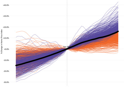
This interactive Tableau chart shows how home prices have changed in various U.S. metro areas. You can change the date for comparison in the top right.