
Data Stories: Graphing Water Danger and Availability
These visualizations convey data about lead in the U.S. water supply and general availability of water.
- By Upside Staff
- July 8, 2020
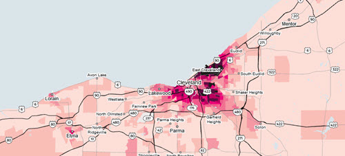
This investigation from Reuters into lead poisoning in the U.S. is a few years old, but still interesting. The interactive visualizations show specific neighborhoods and cities where children face significant risk.
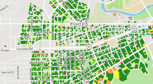
This map uses a mathematical model to predict whether water service lines at specific addresses in Flint, Michigan, might be made of lead or galvanized steel. More information about the model is available in University of Michigan research.
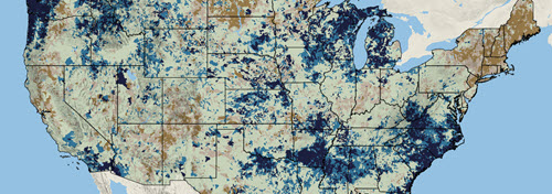
The National Integrated Water Availability Assessments map shows a daily estimate of natural water storage across the U.S. (although it does not yet include Alaska and Hawaii). It uses a simulation model that combines recent weather information with known climate and landscape factors to estimate water availability compared to historical levels.