Data Stories: Visualizing Animal Populations
Understand global fishing trends, the status of endangered species, and the range of bioluminescence with these visualizations.
- By Upside Staff
- June 10, 2020
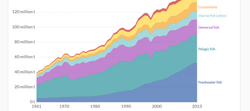
These charts from Our World in Data show current trends in fishing and fish farming with a focus on consumption and fish stocks in jeopardy.

This series of images was a print campaign from 2008, but it’s still an example of effective visual impact. Each image of an endangered animal is highly pixelated -- the number of pixels in the image is the same as the number of living members of the species.
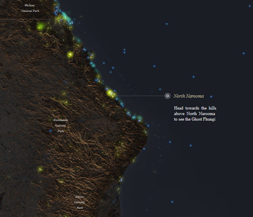
This beautiful map was created in Tableau for Natural Geographic. It illustrates the range of bioluminescent organisms found along the eastern coast of Australia.