Data Stories: Tracking Fines, Flights, and Fish in Real Time
Online data visualizations are a good way to communicate changing data in close to real time. These three very different examples are meant for security-conscious enterprises, travelers, and curious members of the public respectively.
- By Upside Staff
- December 11, 2019

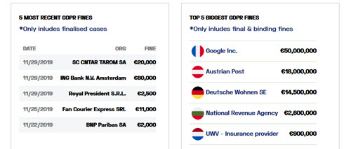
PrivacyAffairs maintains this regularly updated dashboard that allows you to view information about fines levied due to the GDPR. Filters allow viewers to search for more details.

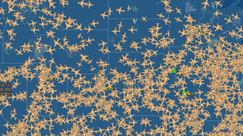
If you or someone you know has flown recently, you have probably already been to FlightAware’s website. The live flight tracking map conveys the complexity of modern air travel, but the website allows you to quickly isolate one flight, the flights on one carrier, or the flights at one airport to view current status.

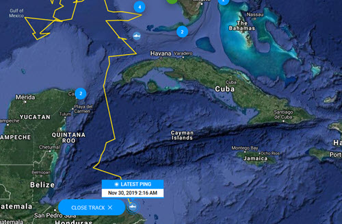
For a bit more fun, explore the OCEARCH live map that shows recent locations of sharks, sea turtles, and other ocean animals being tracked by researchers.