
Data Stories: Thanksgiving Calories, Longer Nights, Christmas Music
Thanksgiving dinner as an infographic, visualizing seasonal change, and analyzing holiday radio.
- By Upside Staff
- November 27, 2019
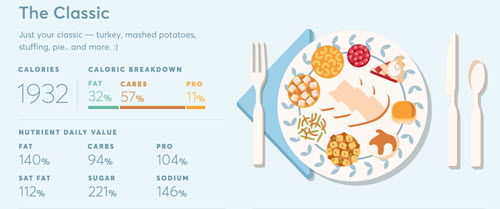
This infographic from a food data initiative attempts to quantify different variations on a classic Thanksgiving dinner.
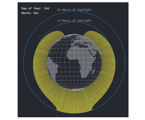
We know that the hours of daylight around the world vary through the year, but this animated gif illustrates what that means.
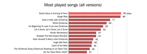
Wonder how many times you’ve heard the same song? Visual journalist Jon Keegan analyzed five days’ worth of holiday radio to get some answers.