
Data Stories: How Much Complexity Is Too Much?
Articles about designing dashboards for CEOs, communicating complex information, and what we can learn from centuries of data visualization.
- By Upside Staff
- September 4, 2019
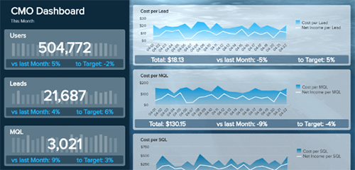
A selection of tips and examples for what could be considered the most important BI tool in your organization—your CEO’s dashboard.
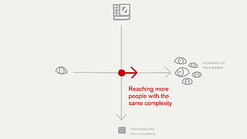
In a talk given in honor of the 150th anniversary of the periodic table of elements, data viz expert Lisa Charlotte Rost discusses how to communicate complex ideas to a wider range of people.
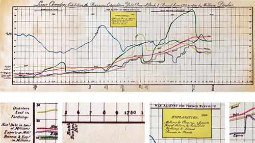
A collection of antique data visualizations and the lessons that can still be learned from them.