
Data Stories: Visualizations with Unusual Materials
As these examples demonstrate, data does not have to be confined to a digital display. Professionals and amateurs use clay, yarn, and paint to create these unique data visualizations.
- By Upside Staff
- January 23, 2019
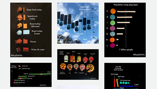
Data visualization pro Amy Cesal uses Play-Doh to create unique, colorful, three-dimensional data visualizations.
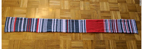
A German woman kept track of delays in her 2018 commute by knitting the information into this scarf, as reported by CNN.
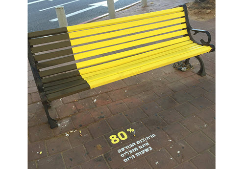
Visual artist Roni Levit painted graphs and charts on public stairs and benches to publicize data about urban development in a city near Tel Aviv.