
Data Stories: Better Bar Charts
Improve your charts by following best practices, choosing the most effective layout, or combining chart types to convey more information.
- By Upside Staff
- April 25, 2018
Consumers have high standards for data visualizations today. Make sure you’re following these basic guidelines for clear, informative charts.
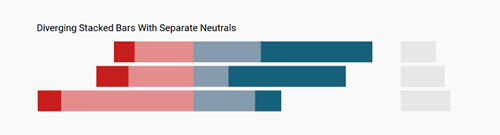
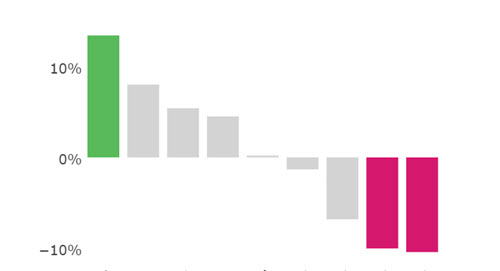
Even something as simple as a bar chart can be presented in many ways. This post from Datawrapper presents the pros and cons of different configurations for stacked bar charts.
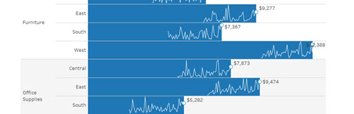
Given more tools for data visualization, users are combining charts in new ways. This post explains how to use Tableau to combine a bar chart with a sparkline.