
Data Stories: Maps of Helmet Safety, Worker’s Compensation, and Pac-Man
Visualizations illustrate the effect of helmet laws, the difference in worker’s compensation policies, and where to hide from digital ghosts.
- By Lindsay Stares
- October 18, 2017
Helmet Laws and Safety
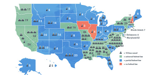
This map shows the relationship between helmet laws and motorcyclist safety. It’s a cute graphic, but in this case the accompanying chart in the article is easier to read.
The Value of Body Parts
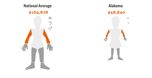
This map of the human body illustrates different state compensation policies for injury on the job; it’s an interactive visualization created for a 2015 investigation by ProPublica. The size of the image changes to reflect different amounts.
Can You Beat the High Score?

A more light-hearted look at danger is provided by the Pac-Man Safety Map by data scientist Seth Kadish. It illustrates how far you are from intersections at any point in the standard Pac-Man maze.
About the Author
Lindsay Stares is a production editor at TDWI. You can contact her here.