Data Stories: Visualizations that Encourage Investigation
Do you want to present an answer or allow discovery? These visualizations about employee poaching, Trump’s business empire, and the movie industry invite exploration.
- By Lindsay Stares
- February 15, 2017
Employee Poaching at Tech Industry Leaders

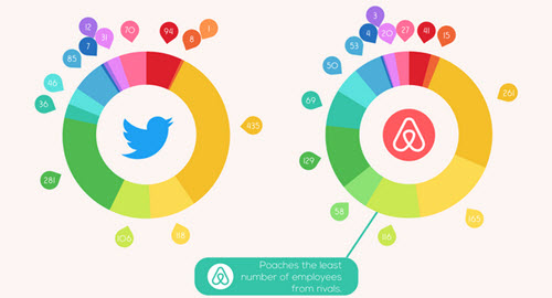
This infographic uses LinkedIn data to show how many employees previously worked for one tech giant and now work for a different one. A few major statistics are highlighted by the author, but if you want more than a cursory overview, you’ll have to pay attention to the colors and do come careful looking.
For example, notice that almost every ring has a wide green band representing a large percentage of employees coming from Microsoft. On the other hand, the light blue for IBM is uneven -- lots of IBM employees move on to certain companies (Microsoft, Intel, HP, Salesforce) but comparatively few end up at online heavyweights such as Twitter, Uber, or AirBnB.
A Deep Dive into Business Connections

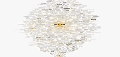
This complex visualization allows viewers to explore President Trump’s business, monetary, and political connections. As Wired points out, it’s presented without commentary on purpose; the point is to allow viewers to investigate by clicking through connections to see what they find.
Movie Formulas and Outliers

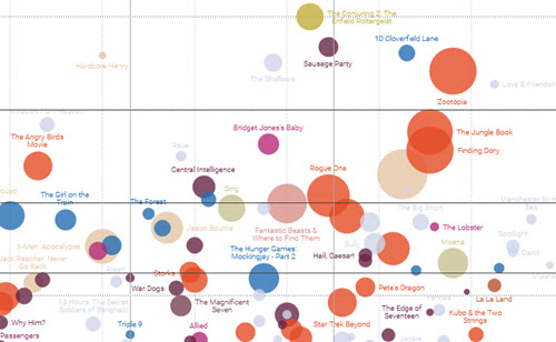
On a lighter topic, Information is Beautiful presents this chart of recent movie statistics. The default plots critical response against how much of the budget the movie made back, but you can change what the axes represent, how the movies are color-coded, which year is shown, etc.
Does the opening weekend gross correlate to the critical response, the audience response, the budget, or none of these? What about the foreign box office totals? There are dozens of ways to explore this data set.
About the Author
Lindsay Stares is a production editor at TDWI. You can contact her here.