
Data Stories: What Does Interactive Really Mean?
Making your visualization interactive may involve many different levels of interaction, including providing greater detail, a hands-on feeling, or an invitation to explore.
- By Lindsay Stares
- February 8, 2017
Interactivity Provides Greater Detail
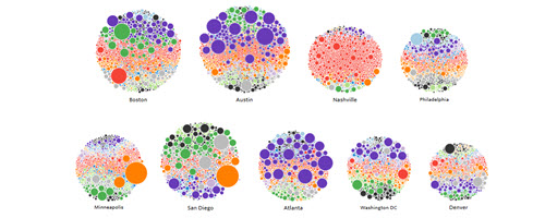
When we talk about interactive visualizations, we often mean pieces such as this exploration of Kickstarter projects by city.
The visualization color-codes projects to show what types of projects are supported in different places, and it’s accompanied by a description that points out some important conclusions. The interactivity is limited to highlighting different project types and hovering over any bubble to see greater detail.
Interactive and Static at the Same Time
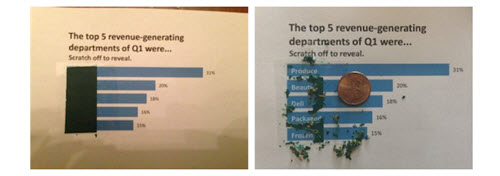
This article from Visualizing Data spotlights some visualizations in the real world that could be called interactive. From print-outs and coloring pages to a magazine you’re invited to throw a dart at, these are creative ways to invite viewers to engage with data.
Many Ways to Slice the Data
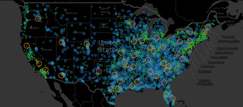
This example dashboard shows how large amounts of data -- in this case, the spread of Walmart stores -- can be interactive. This type of dashboard allows you to investigate many different questions with the same visualization.
About the Author
Lindsay Stares is a production editor at TDWI. You can contact her here.