
Data Stories: Mapping Locations, Efficient Routes, Street Angles
Visualization techniques are great for solving spatial questions, such as finding the closest amenities, determining the best travel routes, and plotting the angles of streets.
- By Lindsay Stares
- November 16, 2016
Where’s the Closest Store?
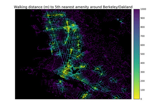
This blog post from Ph.D. candidate Geoff Boeing uses Python and its pandana library to explore neighborhood amenities in-depth. He demonstrates how you might create maps with different purposes to show proximity to specific types of facilities.
What’s the Fastest Route?
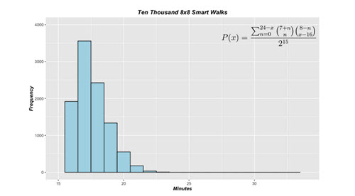
Amateur statistics blog perplex.city compared how fast you can reach a city destination by walking directly (taking only necessary turns) versus zigzagging through a grid of streets. Their analysis takes into account changing traffic signals and varying block lengths. It’s a fun example of using simple probability and statistics to optimize a task.
How Many Streets Really Run at Right Angles?
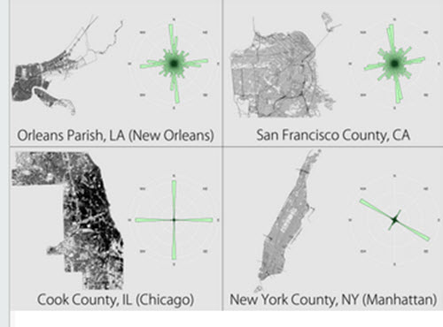
Here’s one more inventive way to learn something new about city streets with visualization. Data scientist Seth Kadish graphed the angles of city streets to demonstrate at a glance the difference between a city layout that is primarily a grid and one that isn’t.
About the Author
Lindsay Stares is a production editor at TDWI. You can contact her here.