
Data Stories: Correlation Is Not Causation
Bad visualizations are everywhere: some are created for humor; some are intended to trick viewers. Are you being fooled by misleading charts?
- By Lindsay Stares
- August 31, 2016
A Humorous Exercise in Spurious Statistics
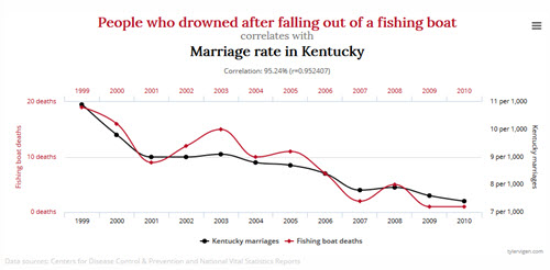
Harvard student Tyler Vigen hosts this collection of charts which demonstrate random correlations. Be amazed at how the consumption of margarine correlates closely to the divorce rate in Maine, then ask yourself whether there is really a connection the next time you see a set of correlated data.
Watch Out for Intentionally Bad Visualizations
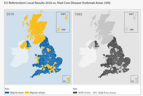
A correlation map made as a joke was briefly taken seriously in the wake of the Brexit vote earlier this summer, as reported on Snopes and Yellowfin’s BI blog. Don’t believe everything you see online!
Are Your Charts Clear and Accurate?
Finally, this article from the Harvard Business Review demonstrates how easy it can be to mislead viewers with chart data -- either intentionally or unintentionally.
About the Author
Lindsay Stares is a production editor at TDWI. You can contact her here.