
Data Stories: The Impact of Global War
Visualization can be used to understand the actual and potential impact of war. See how many died in World War II and how many could have died from further nuclear conflict.
- By Lindsay Stares
- August 24, 2016
Map of Declassified Nuclear Targets
This map from the Future of Life Institute marks each of the recently declassified U.S. nuclear targets from 1956. To explore the potential for catastrophe, you can simulate a detonation at any location. Select or type in a size for your warhead, and the simulation will show you how much land would be destroyed and how many people would probably be killed.
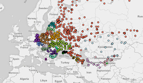
See the Deaths of World War II
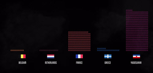
This 18 minute documentary (with optional interactive portions) explores the impact of World War II through a series of in-depth charts and graphs.
It’s an incredibly moving and polished example of data storytelling. The creators use the visuals to put the numbers in context and juxtapose them with specific photos and sound to enhance the viewer’s emotional involvement.
About the Author
Lindsay Stares is a production editor at TDWI. You can contact her here.