Data Stories: Improve Data Visualization with Good Design
To create a good visualization, you must consider the purpose, the data, and the audience, and it helps to know a few fundamental design principles. These three articles will help you improve your visualization skills by exploring those principles.
- By Lindsay Stares
- July 27, 2016
Is Good Design Universal?

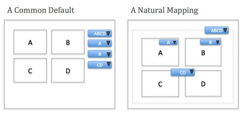
How do you judge whether your data visualizations are functional? A good visualization must be designed with the audience in mind. If your audience is expecting a chart that simply shows growth or shortfall, don’t confuse them by including multiple other variables. Don’t make your users guess how your UI works. This blog post explains how basic principles of good design can apply to data visualizations as well.
Make sure you also check out this video from Vox on doors and human-centered design.
What Are You Trying to Say With That Chart?

This article from the Harvard Business Review (limited access for non-subscribers) explores data visualization in depth. The author breaks visualizations into several broad categories based on the type of information used and the purpose of the final piece.
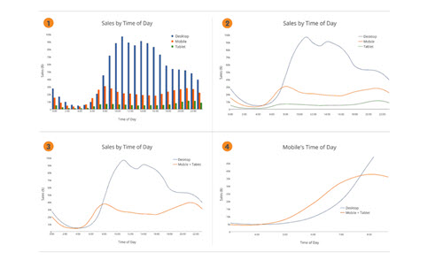
The article includes practical examples of when you might use different types of visualization techniques as well as examples of charts that are confusing or not optimally conveying their messages.
What Is the Purpose of Infographics?

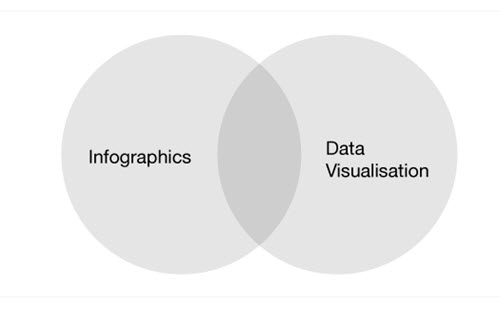
Infographic designer Jack Hagely quickly explains the differences between infographics and data visualizations, providing examples of each.
About the Author
Lindsay Stares is a production editor at TDWI. You can contact her here.