Data Stories: Mapping Shootings and Using Data to Judge Bias
With so much violence in the news, many analysts try to provide context or insight with visualizations and data analysis. However, problems with the quality and availability of data create challenges.
- By Lindsay Stares
- July 13, 2016
Police Shootings Mapped by Vox

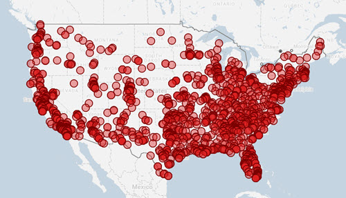
Data about people shot by police officers is reported inconsistently across the U.S. The nonprofit Fatal Encounters has been trying to collect and verify as much data on the subject as possible. Vox recently compiled their data into this interactive map -- you can explore different areas and click to see details of each incident.
Studies Find Differing Amounts of Bias in Lethal Force

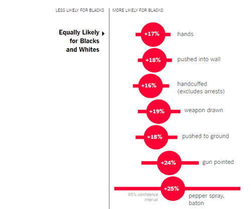
Many data researchers are investigating potential bias in police departments. The New York Times reported on a new study across 10 cities that showed black citizens were not more likely to be shot by police, but they were more likely to have non-lethal force used against them.
The researchers acknowledged that they only looked at a small set of data and that more research should be done.
At the same time, The Washington Post has reported on a study that finds that unarmed black men are more likely to be shot by police than unarmed white men. This finding was based on the newspaper’s own extensive collection of data from 2015, although this data is also incomplete. You can explore this data in an interactive chart.
Overall Gun Violence in America

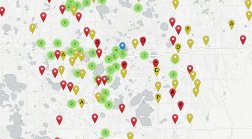
In partnership with the nonprofit, nonpartisan Gun Violence Archive, Slate.com provides another interactive map; it currently shows shootings across the U.S. from June 2015 through the June 2016 attack in Orlando. They intend to help viewers understand the scope of gun violence, including both fatal and non-fatal incidents.
About the Author
Lindsay Stares is a production editor at TDWI. You can contact her here.