Data Stories: Comparing Global Populations, Home Prices, and Teacher Salaries
A good visualization can answer a question or provoke discussion. Today, find out how where you live affects how much you spend on health care, your home, or your schools.
- By Lindsay Stares
- June 1, 2016
Comparing Country Statistics

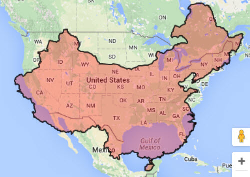
How would your life be different if you lived in another part of the world? Ifitweremyhome.com allows you to compare countries on a number of variables, including common statistics such as average life expectancy as well as more unusual ones, such as average electricity use, cost of health care, and average amount of free time.
It uses color to give a quick overview of positive and negative trends, and you can expand the sections for more information. The map overlay that compares relative size (China and U.S. pictured above) is a nice bonus.
The Aftermath of the Housing Bubble

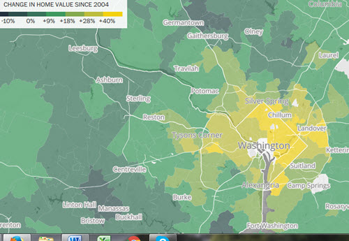
Housing markets have recovered from the recession in some parts of the United States, but overall the recovery is uneven. The Washington Post has used maps color-coded by the increase or decrease in house value to illustrate a series of in-depth pieces about how the market recovery (or lack of recovery) is affecting communities across the country. It’s a textbook example of using data alongside narrative to explain a trend.
The site offers an interactive version of the housing price map as well where you can investigate by ZIP code.
Spending on Teachers around the World

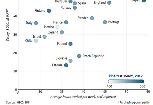
The Economist investigated whether higher wages or shorter working hours for teachers are associated with higher test scores for students and plotted their results. They may not have come to a strong conclusion, but it’s interesting to see how much these metrics vary between countries.
About the Author
Lindsay Stares is a production editor at TDWI. You can contact her here.