Data Stories: Ships at Sea, Economic Recovery, and Scales for Abstract Data
Visualizations are a great way to help users understand vast amounts of data. View two vast data sets created by economic forces and learn more about creating your own visualizations.
- By Lindsay Stares
- May 25, 2016
Shipmap.org Shows the Flow of the Global Economy

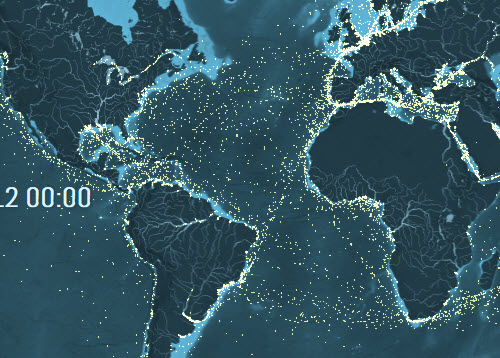
This amazing interactive map shows all of the cargo ships in transit in 2012. You can filter or color code by type of cargo, zoom in and pan the map, or select different dates via the timeline at the bottom. Be sure to click the play button for an introduction to the map and the overall context of the project.
The Impact of the Recession in 255 Charts

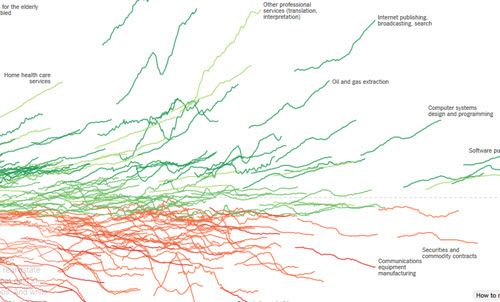
The NY Times charted the recent growth or decline of 255 different industries and combined this information to explore the overall shape of the United States’ economic recovery. As you scroll through the page, explanations appear regarding the recession’s effect on specific sectors and highlight the associated charts. You can explore the entire visualization at the top or bottom of the presentation, or see all the individual charts at the end.
Ready to Step Up Your Visualizations?

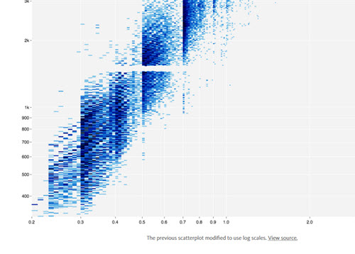
If you create visualizations for your enterprise, you might use the D3.js JavaScript library for producing interactive web graphics. Scales for D3 map abstract data to visual variables, and they are now available in a standalone library. The developer, Mike Bostock, explains the use of scales in this Medium post.
Even if you aren’t yet in a position to work with this code, this post is an intriguing taste of the technology and skill that goes into creating informative visualizations.
About the Author
Lindsay Stares is a production editor at TDWI. You can contact her here.