
Three Practical Ways of Narrating Your BI
Data storytelling is often too abstract to apply to business intelligence. However, there are practical techniques of enhancing BI with words, annotations, and narrations.
- By Jake Dolezal
- March 7, 2016
Qlik has partnered with Narrative Science to provide a free extension to their Qlik Sense product. The Narrative Science product is a natural language generation (NLG) tool that can automatically generate a narrative description of a data set or data visualization. For example, if a visualization shows a line chart of profit and loss trends over the past year, an automated narrative could be generated that essentially "reads" the chart to the business user, e.g., "Profits rose by 13% over the year, while losses dropped by 4%..."
In this brand of data "storytelling," the narrative and the visualization corroborate to tell the same story -- one could validate the other and possibly appeal to different thinking styles or varying levels of analysis experience among the business user community. For the analyst, automating a task that she or he may not perform particularly well -- putting the data into words the average business person can understand -- is appealing.
In my opinion, this is a step forward in data storytelling, which has been a hot topic and pervasive (albeit abstract) theme among BI vendor-tool developments. Qlik, as well as other well-respected tools such as Tableau and Yellowfin, have all incorporated storytelling capabilities in their product development and marketing messages. I am not going to debate the merits or validity of data storytelling here, because as fellow analyst Ted Cuzzillo wrote, "Data storytelling is a good thing, but we still have scant observation of the actual practice of data storytelling -- hard, direct evidence of what has worked, what hasn't, which tools work, ... and other questions."
Instead, I would like to use this opportunity to suggest three practical ways of narrating BI. These pragmatic uses are highly likely to be viewed positively by business users.
Interactive Labels
Data labels are a charting staple that has been around for a long time. However, the overuse of data labels can quickly lead to visual clutter. I recommend you keep labels hidden (except for the case of labelling the top of a peak or the bottom of a trough), and make them visible as the user interacts with the chart -- such as moving the pointer over a data point or a light tap on a tables screen. For further added value, embed more data -- particularly comparative data and delta values -- into the popup or revealed data label. Even more, you can even add a way to drill down into that data point.
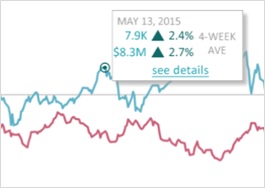
Most modern BI tools on the market offer this capability in one form or another.
Persistent Annotations
Annotated BI does not have a standard definition -- that is, not all people using the term annotated BI mean the same thing. For purposes of this discussion, an annotation is a note, comment, or very short narrative (made by an analyst or business user) about what is going on with a particular piece of data. Many BI tools offer the ability to annotate a visualization. However, the differentiator is the ability to provide persistent annotations.
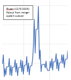
Most annotations are added after the fact for the purposes of a presentation to reveal the analyst's brief assessment of comment about something that "sticks out" on the chart. The figure shows such an example. The problem is, what happens to that annotation after the presentation? Is it retained, curated, or stored for future reference -- that is, does it persist? Is it made available to other analysts and business users who may view the same data later? Most BI tools do not offer this level of capability, where the annotation persists and lives on alongside the data itself.
Full Narratives
The closest practical annotation technique to data storytelling is providing a full narrative to accompany a BI report, artifact, or visualization. Narratives can be powerful in helping a wider audience understand their data. Charts and graphs are not always a language everybody easily understands. A picture is worth a thousand words, but what words?
Narratives can also help users come to consensus about how data and BI are interpreted. However, caution is required because narratives can be deceptive if told from a biased perspective. The barrier to full narratives, of course, has been the time it takes and the written communication skills needed to produce a quality, thoughtful narrative. Time will tell if the Narrative Science add-on to Qlik Sense to create automated narratives will be accepted by the larger BI community. Regardless, I applaud them on the foresight to put such a capability out there.
Regardless of the techniques you choose, know that numbers, tables, charts, and graphs almost always need words to accompany them -- whether they are just spoken or persisted and leveraged as business intelligence is up to you.
About the Author
Jake Dolezal
Dr. Jake Dolezal is practice leader of Analytics in Action at McKnight Consulting Group Global Services, where he is responsible for helping clients build programs around data and analytics. You can contact the author at
[email protected].