Data Visualization Technology
By Wayne Eckerson and Mark Hammond
There are two main categories of data visualization technology:
visual reporting and visual analysis.
- Visual reporting. Visual reporting uses charts and graphics
to depict business performance, usually defined by metrics
and time-series information. The primary type of visual
report is a dashboard or scorecard, which gives users a
visual snapshot of performance. The best dashboards and
scorecards enable users to drill down one or more levels to
view more detailed information about a metric. In essence,
a dashboard is a visual exception report, highlighting
performance anomalies using visualization techniques.
- Visual analysis. Visual analysis, on the other hand, enables
users to visually explore data to discover new insights.
While visual reporting structures the navigation of data
around predefined metrics, visual analysis provides a much
higher degree of data interactivity. With visual analysis,
users can visually filter, compare, and correlate data at
the speed of thought. Visual analysis tools also often
incorporate forecasting, modeling, and statistical, what-if,
and predictive analytics.
Visual Reporting
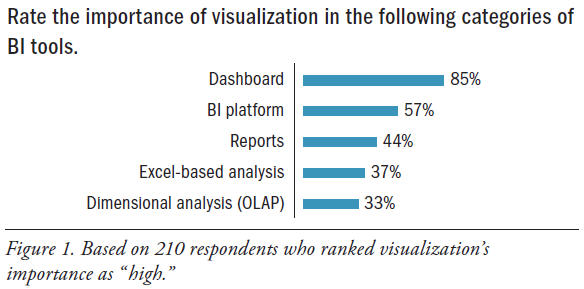
Dashboards. By a sizable margin, dashboards are the preferred
medium for data visualization. Nearly 85% of respondents
ranked the importance of visualization as “high” in dashboards.
On the other end, only 33% considered visualization to be
highly important in an OLAP tool. (See Figure 1.)
There are a near-infinite number of ways to design the visual
elements of a performance dashboard. Most dashboards arrange
a series of related charts in a grid template, usually two-overtwo
or three-over-three, and use multiple tabs or radio buttons
to segment charts by category. They also usually display filters
above or beside the charts they apply to, as well as links to
related dashboards or reports. The best dashboards display
summary data graphically so it can be consumed at a glance
and then provide access to any detailed information a user
might need within three clicks.
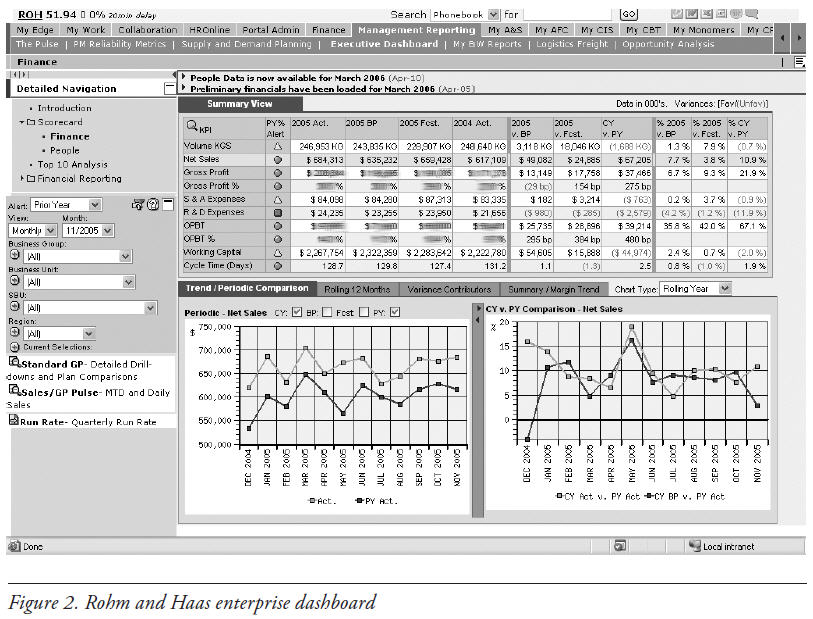
Sample Dashboard. For example, the dashboard from Rohm
& Haas (now owned by Dow Chemical) is embedded in the
company’s corporate portal, which has links (arrayed on top)
to other enterprise content as well as other dashboards housed
by the portal. (See Figure 2.) The dashboard itself consists of
a table of 10 key performance indicators (established by top
executives) that apply to every business unit and region in the
company, along with pertinent targets (last year, variance,
percentage change, and so on). Next to each metric are visual
stoplights, which indicate the status of performance for the
given metric against a selected target. Stoplights are perhaps the
most common way to visually highlight exception conditions in
a dashboard because they attract a user’s attention quickly.
Below the grid are two somewhat interactive charts that show
a time-series trendline for the metric highlighted by the user’s
cursor above. The left-hand panel contains the navigation path
to the current view, and below that, a set of filters that users
can use to change the alert in the grid and drill down to view
performance along the same metrics at lower levels of the
organization. (These filters are “universal” in that they apply to all
objects on the screen instead of a single object.) The bottom of the
panel contains hard-coded links to related dashboards and reports.
As you can see, the Rohm & Haas enterprise dashboard gives
executives and managers a snapshot of performance for their
domains with alerts to highlight exceptions and moderate levels
of interactivity to drill into details and view related information.
With a glance, executives and managers can see the status and
trend of performance in their areas and how it compares to
major benchmarks. Many companies are adopting this type of
visualization to better monitor and manage performance.
Visual Analysis
Visual analysis tools enable power users and business analysts
(such as financial, marketing, and sales analysts) to explore
data sets visually and identify trends and anomalies. These
tools usually work with data stored in memory and expose rich
navigational features that let users explore data at the speed
of thought. Many also incorporate some form of statistical or
predictive analytics.
Visual analysis tools compress and store data in memory,
providing sub-second response times for any action taken
against the data (such as filtering, drilling, calculating, sorting,
and ranking). Visually, analysts point and click to interact with
charts, apply filters, and change views. For instance, analysts
can use their mouse to “lasso” data points in a certain section
of a scatter plot to create a new group and automatically filter
other charts on the page. (See Figure 3.)
Compared to OLAP tools, visual analysis tools don’t require
an IT person to design a dimensional data model. The tools
use a “load-and-go” approach in which analysts load raw data
from multiple sources and simply link tables along common
keys to get a unified view of the data set. As a result, most visual
analysis tools can be deployed in a few hours or a few days
or weeks, depending on the number of data sources and their
complexity and cleanliness.
Analysts or developers often use visual discovery tools to create
and publish interactive, departmental dashboards for casual
users. They often create the dashboards on desktop machines
and then publish them to a departmental server for general
consumption. When doing so, the developers generally strip
out some analytical functionality and options that might
overwhelm casual users.
Two Environments. It should be clear that visual reporting
and visual analysis tools serve two different audiences and
purposes. While visual reporting tools are designed to visualize
performance against predefined metrics for executives and
managers, visual analysis tools empower business analysts
to explore trends and anomalies in data sets they create and
publish views for others to consume.
Visualization Technology
Both types of visualization solutions leverage emerging
technology to enhance the visual experience of BI users. Here
are key technologies driving the adoption of visualization in
corporate environments.
- 64-bit systems and multi-core servers. Charting engines
chew up a lot of CPU cycles, especially if the charts
are interactive. Rendering charts, especially in serverbased
environments, takes a lot of horsepower. Today’s
64-bit platforms and multi-core processors speed visual
processing to give users more dynamic and interactive
visual environments in which to view data.
- RAM and compression. Many visualization tools work with
in-memory data to ensure speed-of-thought interactivity.
With prices for RAM dropping, it’s easier for power users
to analyze large data sets (up to 50 million records) held in
memory. New compression techniques increase the amount
of data that can be held in memory—but be cautious of
decompression performance penalties.
- Java applets/Active X controls. These mini-applications
run inside a Web browser and execute within a virtual
machine or sandbox. Actions execute as fast as compiled
code, making them an easy way to recreate full-featured
applications on the Web. However, they raise security
concerns, so many IT administrators prevent users from
downloading such controls through corporate firewalls,
which limits their pervasiveness.
- DHTML and AJAX. A lighter-weight approach is to embed a
scripting language inside HTML pages, such as JavaScript,
that executes functions in the browser. Dynamic HTML
(DHTML) uses scripting to animate a downloaded
HTML page. For example, DHTML is often used to
animate drop-down boxes, radio buttons, mouseovers, and
tickers, as well as capture user inputs via forms. AJAX
(asynchronous JavaScript and XML) takes this one step
further and retrieves new content from the server in the
background without interfering with the display and
behavior of the page. Basically, AJAX enables users to add
new data to the dashboard without having to reload the
entire page. It can also be used to pre-fetch data, such as
the next page of results.
- Flash. Another popular approach is to use multimedia
development platforms, such as Adobe Flash, Java
applets, Microsoft Silverlight, and Mozilla Scalable
Vector Graphics (SVG), which add animation and
movies to Web pages. Compared to Java scripting, these
plug-ins provide stunning graphics and animation for
displaying quantitative information, which makes the
user interfaces very appealing to business users. They
load both visualizations and data simultaneously in a
single file rather than dishing up dozens or hundreds of
pages. Although this makes the initial load slower than a
comparable DHTML or AJAX application, performance
thereafter is exceptionally fast, since the data required to
display all components on a page resides locally.
Vendor Advancements. BI vendors have been scrambling to meet
increasing demand for visualization. For instance, Oracle’s release
of Oracle Business Intelligence Enterprise Edition (OBIEE)
11g in mid-2010 addressed visualization weaknesses in earlier
releases, Oracle officials said. Vendors such as MicroStrategy,
ADVIZOR Solutions, and Tableau Software have recently
emphasized new in-memory capacity for greater scalability. SAS
(with its JMP visualization software) and DSPanel are among
vendors incorporating the open-source R statistical programming
language to mix visualization and data mining.
Corda and Dundas, which both provide charting components
and dashboard tools, have expanded their tool sets to give
developers greater flexibility. Microsoft is aiming to elevate
Excel’s profile for BI visualization with the 2010 release
of PowerPivot, an add-on that helps Excel accommodate
large-scale data and extends its visualization capabilities,
Microsoft officials said. Similarly, PowerPivot can leverage new
visualization capabilities available through SharePoint 2010
integration with Visio, they said.
Many of these innovations are aimed at untethering business
users from a reliance on IT so they can analyze data in a visual
environment. “It’s an evolutionary thing,” said Doug Cogswell,
president and CEO of ADVIZOR Solutions. “We’re used to
using BI to view reports or KPIs, and now people want to move
beyond reporting to visual analysis.”
Wayne Eckerson has been a thought leader in the data warehousing,
business intelligence, and performance management fields since 1995. He
is the author of the best-selling book Performance Dashboards: Measuring,
Monitoring, and Managing Your Business, second edition (John Wiley &
Sons, 2010). Wayne is the former director of education and research at TDWI,
and currently director of research at TechTarget and president of BI Leader
Consulting. He can be reached at [email protected].
Mark Hammond is a veteran contributor to TDWI and TDWI Research,
including a number of research reports, TDWI’s Business Intelligence
Journal, and the TDWI Marketplace. He researched and co-wrote E-Business
Intelligence: Turning Information into Knowledge into Profit (McGraw-Hill,
2000) with the former CEO of Business Objects. An award-winning journalist,
Hammond’s work focuses on the use of data to improve business and
organizational performance. You can reach him at [email protected] or
[email protected].
This article was excerpted from the full, 20-page report, Visual Reporting and
Analysis: Seeing Is Knowing. You can download this and other TDWI Research
free at tdwi.org/bpreports.
The report was sponsored by ADVIZOR Solutions, Corda, DSPanel, Dundas,
IBM, Microsoft, MicroStrategy, Oracle, SAS, and Tableau Software.
This article originally appeared in the issue of .