
Data Stories: The History and Modern State of Data Journalism
These articles explore modern data journalism -- how charts in the newspaper have changed, the growth of interactive visualizations, and the importance of data storytelling for news organizations.
- By Lindsay Stares
- October 12, 2016
The History of Charts in the News
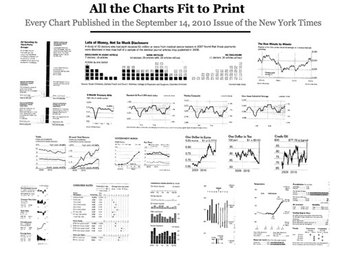
Priceonomics investigates how charts and data first started being printed in newspapers. The author calculated the rate that charts have been published in the New York Times and includes a selection of examples from over the years, as well as information about the overall history of data visualization.
The Rise of Interactive Data Journalism
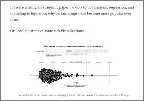
Matthew Daniels of Polygraph provides another perspective in this Medium post. He discusses how information is being conveyed to readers today in new and innovative ways because so many people with a specialty in code or data are working in journalism.
The New Graphics Team Model
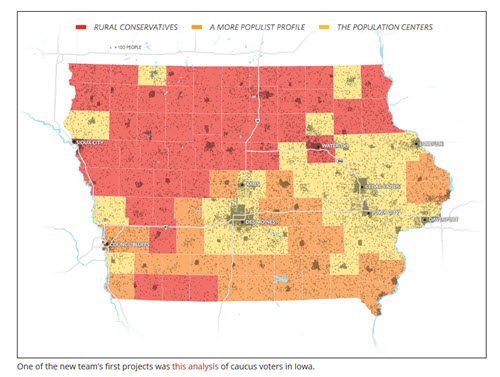
This article by the graphics director at The Wall Street Journal details the creation of a modern data storytelling team. The author describes the benefits of integrating the print and online teams and the rise of data-first stories.
About the Author
Lindsay Stares is a production editor at TDWI. You can contact her here.