LESSON - Storyboarding: Building Effective Dashboards
By Lawrence Pier, Dashboard Specialist, and Shadan Malik, Software Architect, iDashboards

The dashboard is the new face of information management. It offers an instrument panel of business metrics for data-loaded decision makers. It must provide visually rich, responsive, and real-time insight that allows its user to track and drill down through a wealth of information. Storyboarding is required to build effective dashboards that align organizational information with organizational strategy.
Storyboarding
The term storyboarding is derived from the field of multimedia design, in which animation is first conceptualized through a panel of sketches outlining the scene sequence and major changes of action. In other words, storyboarding is the process of telling a story for animation through static images. Similar to a multimedia concept that may involve defining user interaction and corresponding response, a good dashboard is rich with user interactions and responses to those actions.
Storyboarding brings together all key areas of the dashboarding process: information identification, audience definition, and presentation. The following steps should be adhered to when constructing a dashboard storyboard:
1. Identify key user groupings
2. Identify key dashboard groupings
3. Determine the privilege matrix: user groups and dashboard groups
4. Sketch a dashboard layout for each dashboard group
5. Sketch a navigation or drilldown sequence for each dashboard component on every dashboard template
Storyboarding for an Executive Dashboard
Located in Bloomingdale, Illinois, NOW Foods is one of the country’s most respected manufacturers of award-winning products, including vitamins, minerals, dietary supplements, natural foods, and other health-related products. The company manufactures over 1,800 health supplements from its state-of-the-art, 209,000-square-foot facility.
The company’s senior management wanted live visibility to key performance indicators (KPIs) from their Oracle Apps ERP to provide monthly trends and comparison with data from previous years. Prior to implementing dashboards, they could get access to the KPIs only at periodic intervals when the analysts would extract the data, import it into Excel, create charts, and finally transfer them into PowerPoint for presentation.
The following is a storyboarding outline of key performance indicators and their real-time presentation as needed by the senior management in the company:
1. Filled orders versus average time to ship: A line and bar combo chart comparing the number of orders filled to the average time to ship across all products on a monthly basis. Drilling down from this chart displays another chart showing the percentage of orders shipped by order type within the last 24-hour period. Second-level drilldown from this chart shows a speedometer with the percentage of orders shipped by warehouse for unique order types within the last 24 hours. Third-level drilldown from this chart provides a list of the top 50 orders that took the longest to ship for that month.
2. Monthly fill rate: A column chart expressing the monthly fill rate for 12 months. Drilldown on a given month provides the fill rate by division for that month.
3. Percentage of orders shipped: A speedometer showing the company’s total percentage of orders shipped complete on a monthly basis. Drilling down from this chart displays another chart showing the percentage of orders shipped complete by order type. Second-level drilldown from this chart shows a table of the percentage of orders shipped complete by warehouse for that order type. Third-level drilldown provides a list of the top 50 items that failed to ship for that month, causing the low percentage.
4. Inventory level by state: A map chart showing the current month’s inventory level for each state. Drilling down into the map generates the 50 locations with the lowest inventory levels.
5. Return on investment: A report showing 12 months of return on equity and return on capital, highlighting the exceptions when either value was above 9.0 or below 4.0.
6. Assets by equity: A pie chart showing monthly assets by equity ratio. Drilling down from this chart shows the total assets and equity as line charts trended for the last 12 months.
End Solution
A joint team of NOW Foods analysts, database analysts, and iDashboards consultants developed an executive dashboard that met all the requirements of delivering real-time KPIs to the management team.
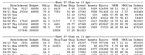
Illustration 1. A typical production report prior to the executive dashboard deployment.
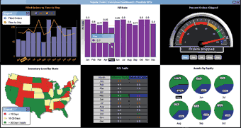
Illustration 2. An executive dashboard showing the monthly trend for several key performance indicators—users click on a chart to drill down into further details per the storyboard.
Storyboarding for a Performance Evaluation Dashboard
A leading healthcare organization with more than 500 physicians wanted a performance evaluation dashboard for their physicians. Each physician could monitor his or her performance across different evaluation criteria; scores would be based on patients’ feedback. They could also see the scorecards of the overall department to assess their relative performance. The following is a storyboarding outline of their performance indicators and the scorecards presentation as needed across the organization.
1. Physician ratings: A set of speedometers showing each physician’s rating scores for patient explanation, patient listening, and patient attention. The speedometer colors indicate poor, good, and outstanding performance.
2. Physician evaluation scores: Metrics goals chart that would indicate each physician’s scores using a four-color evaluation framework against predefined goals for his or her specialty. These scores are for their technical, effectiveness, motivation, and leadership attributes.
3. Specialty scores: Column chart showing overall rating scores for each specialty. Also, a superimposed line chart comparing similar scores for the previous year.
4. Patient satisfaction scorecard: Metrics bubble chart that indicates each physician’s scores using a three-color evaluation framework against predefined benchmarks for his or her specialty. These scores are derived from the patient feedback regarding the explanation, listening, attention, and waiting qualities of the physician. Based on patient feedback for each physician, the overall patient satisfaction score aggregated by each specialty for the latest time period. A pie chart for each specialty represents the satisfied versus not-satisfied patients.
End Solution
With iDashboards, each physician can now easily monitor his or her individual and department performance with charts that provide synchronous chart highlighting based on the user’s cursor position. When a physician mouses over his ID number in the speedometer chart, for example, he will automatically see his performance highlighted in all other charts.
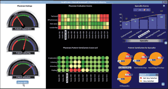
Illustration 3. A performance evaluation dashboard for a healthcare organization, showing physician scorecards as well as overall metrics for each specialty.
Lessons Learned
At the core of successful storyboarding lies the identification of your key dashboard requirements. These requirements are completed before the first chart is constructed. Storyboarding allows your organization to systematically organize how decision makers will receive, view, and use essential business information. As a result, your dashboards will deliver a more effective and uniform picture of your organization.
Shadan Malik is the author of Enterprise Dashboards: Design & Best Practices, published by John Wiley & Sons, portions of which appear here (reprinted with permission).
This article originally appeared in the issue of .